Charts drawn exactly as Excel draws them, in your PowerPoint.
Every chart Bendou builds now looks like the one your analyst would have built in Excel: the same axes, the same labels, the same spacing. It sits in the book next to your existing pages, and nobody can tell which one came first.
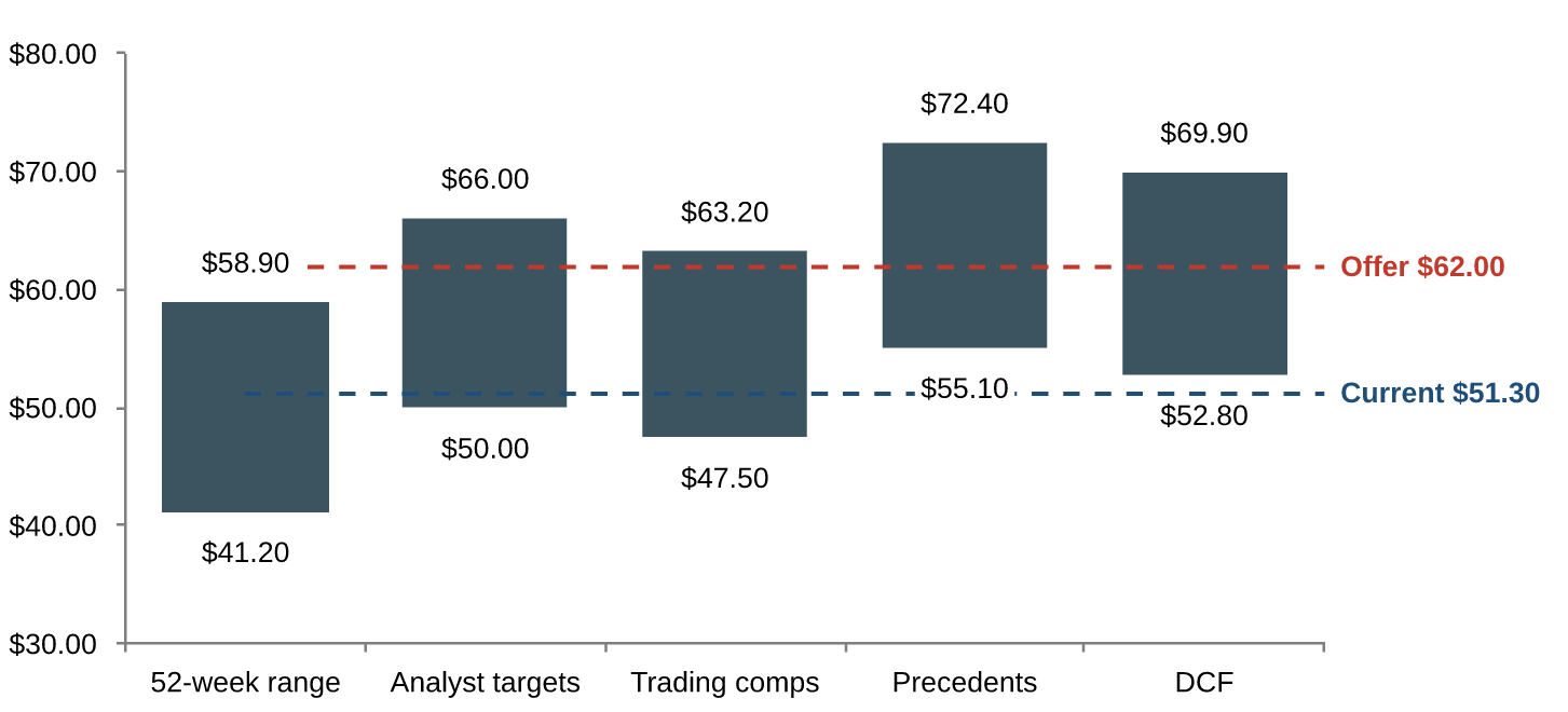
A valuation summary built by Bendou. Figures are illustrative.
Why it matters
A board book is read by people who have looked at thousands of Excel charts. A chart that is almost right stands out: a different axis, labels in the wrong place, bars a little too thick. Until now, that meant an analyst rebuilding AI-made charts by hand before anything went out.
The charts bankers use every day
The pages that fill a pitch book or a board book, built from your numbers and your sources.
Football fieldsValuation ranges by methodology
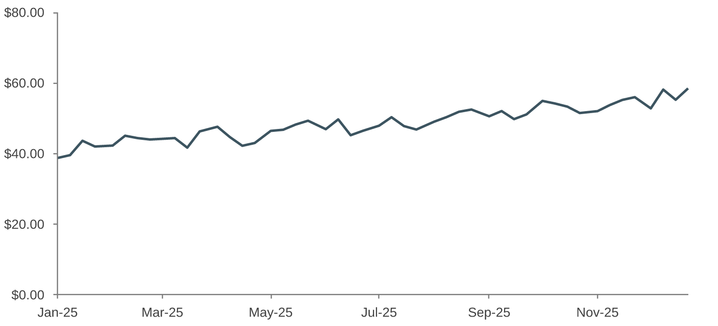
Share price historyOver any period, against peers or an index
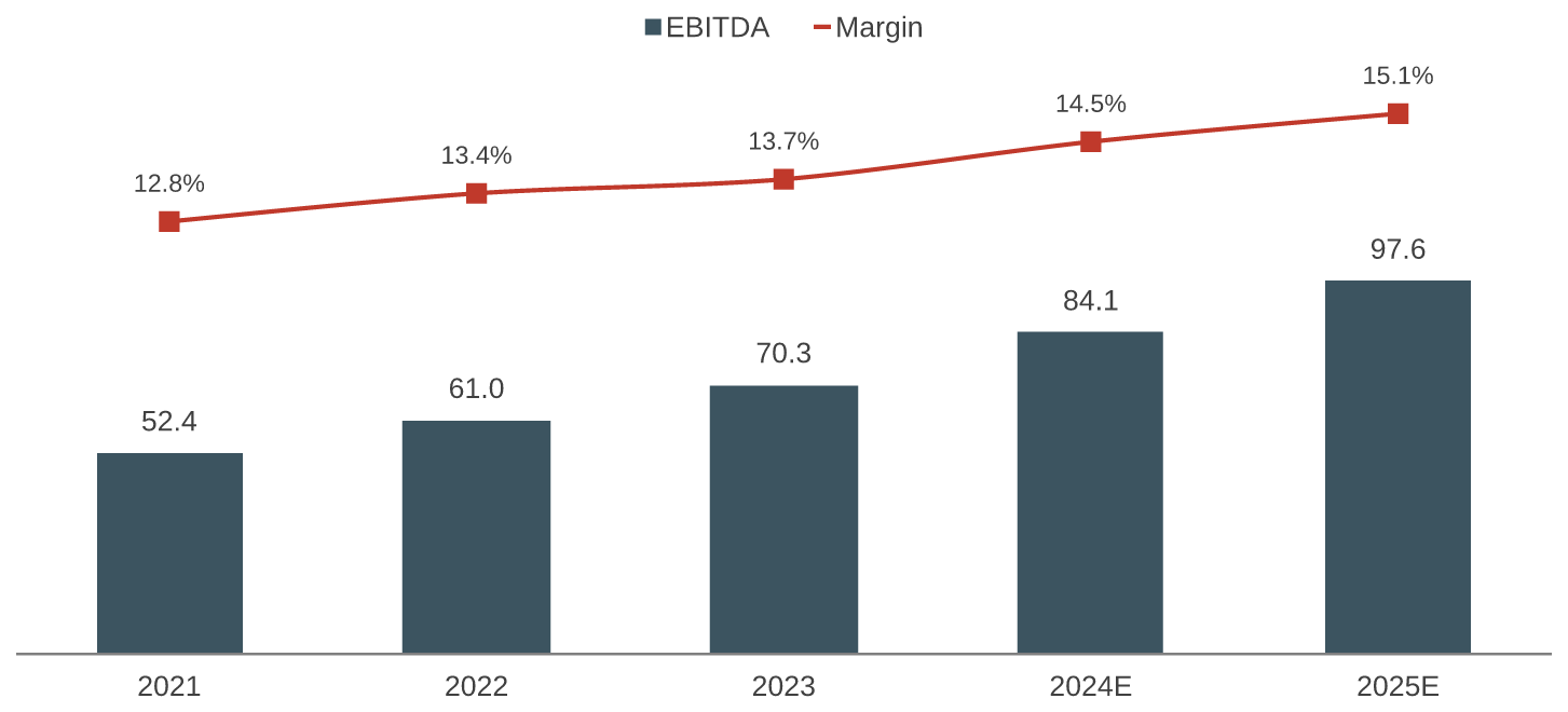
Financial projectionsRevenue, EBITDA and margins

Trading comparablesMultiples against peers
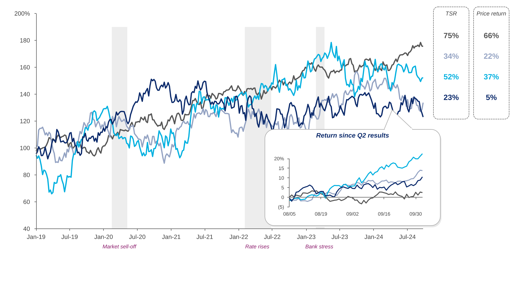
Shareholder returnsIndexed performance over time
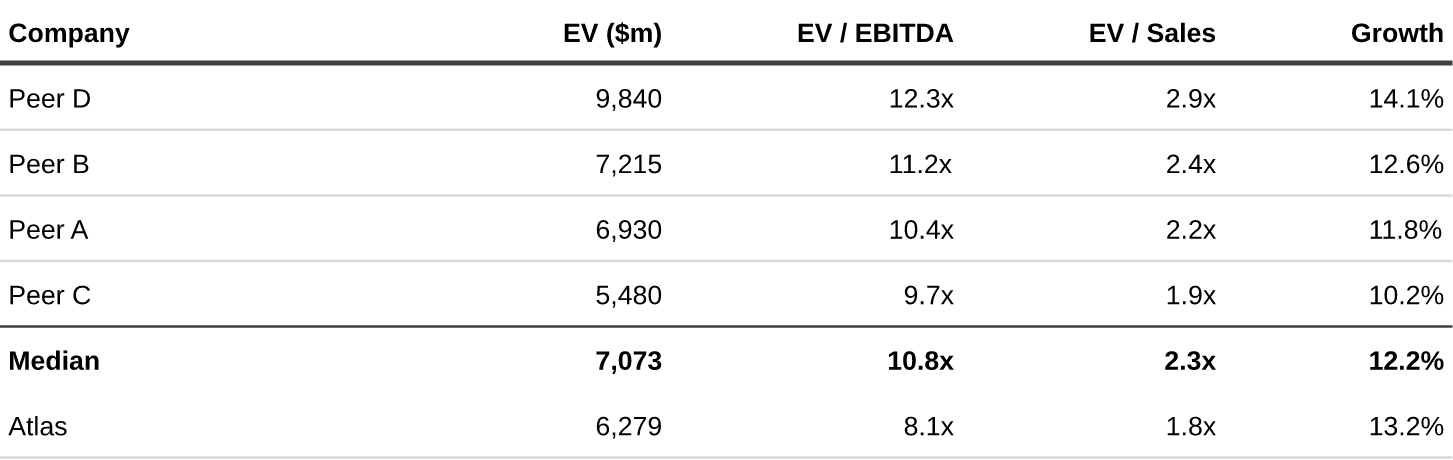
Bank-style tablesComps, premiums and summaries
Measured, not claimed
We asked PowerPoint itself to be the judge: the same chart, drawn by PowerPoint and by Bendou, compared pixel by pixel.
Average match to PowerPoint across six bank-style charts, including three we never tuned on. A frontier AI model writing chart code scored 89.1 on the same test. See the benchmark
Questions
Do I need to change how my team works?
No. Ask for a page the way you would ask an analyst. Bendou builds it in your template, and the charts come out the way your team already makes them.
Does it use my firm's colours and fonts?
Yes. Charts follow your house style, set once when your firm is set up in Bendou.
What lands in PowerPoint?
A 16:9 deck in your template. Text and tables stay editable, and charts arrive as sharp pictures that look exactly like their Excel versions.
Is it available today?
Yes, for every team using Bendou. Ask for a demo and we'll build a valuation summary on your own materials.